Self Chef
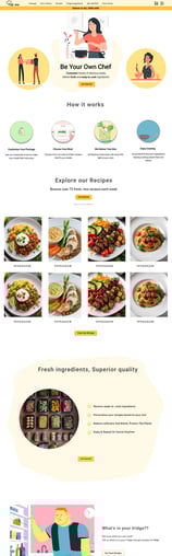
Project Summary: Self-Chef sells fresh and semi-prepared ingredients, tailors recipes to user diets, and recommends meal plans based on inventory and kitchen tools.
My Role: research, design, and test all UIs related to the project
Time Frame: 8/2023 - 12/2023
Design Tools / UX Methods Used: Figma, Miro, Figjam, Canva, Information architecture, competitive analysis, interviews, survey...
Project Type: Concept Team collaboration platform
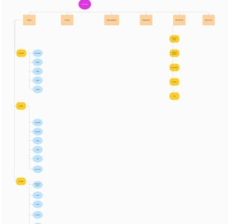
My Design Process
Card sorting and site map
Note: The process wasn't straightforward. Each step required many changes and tests to ensure its success. We tried to follow the steps in the same order, but this is not always possible in real projects.
Define the bussiness
Business and Value propositions:
Potential users:
Problem:
Sending half-prepared meals online throughout England
Customized recipes based on users' diets and interests
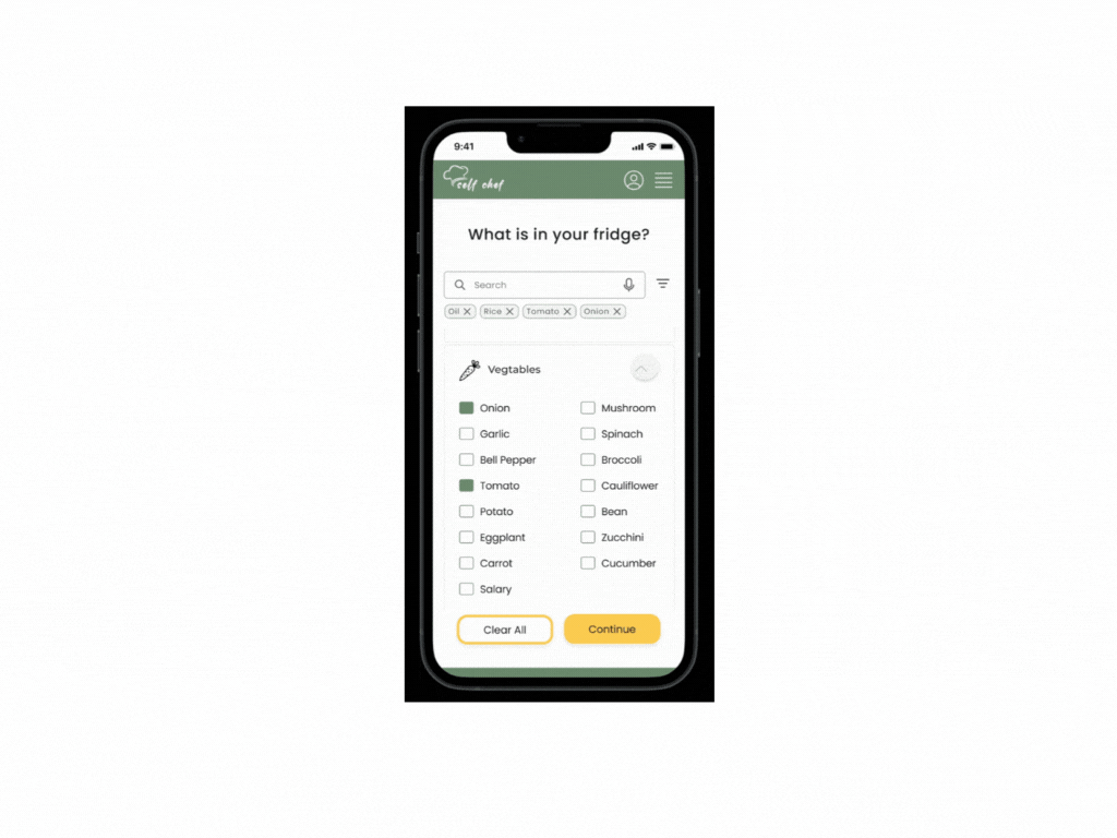
Fridge suggestions recipes
eco-friendly and recyclable packages
People who have little time and prioritize eating a variety of homemade, healthy, and fresh meals.
Our research found that similar businesses require users to purchase weekly packages before they can view their orders and select recipes in advance.
Survey
We made a questionnaire that had ten questions, and 45 people responded.


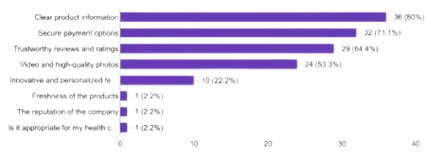
Importance of product information and details of ingredients
Transparent information, secure payment options, and reviews are more important.
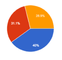
Age range 26 - 45
Step-by-step instructions and Videos are the most convenient way to see the recipe
Interviews and Affinity diagram
"I love trying out different types of food from various cultures, but sometimes, I find it challenging to follow their recipes and figure out the right amount of ingredients for a group of people."
Mina, 34 years old, Germany

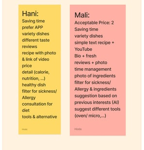
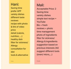

We interviewed ten people in Persian
Each session took 20 - 45 minutes
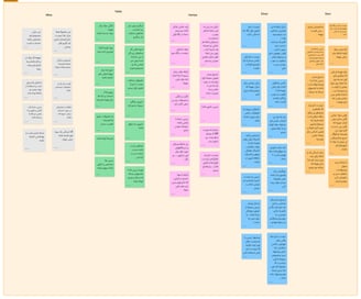
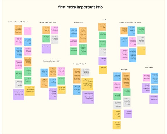
with the result of the interviews, we built the Affinity Diagram
Recipes with step-by-step pictures and videos, along with a list of ingredients.
Information on SelfChef services and prices.
Emphasis on meal diversity and freshness.
Details on meal packaging and delivery.
Our Findings of the Affinity Diagram
Interviews
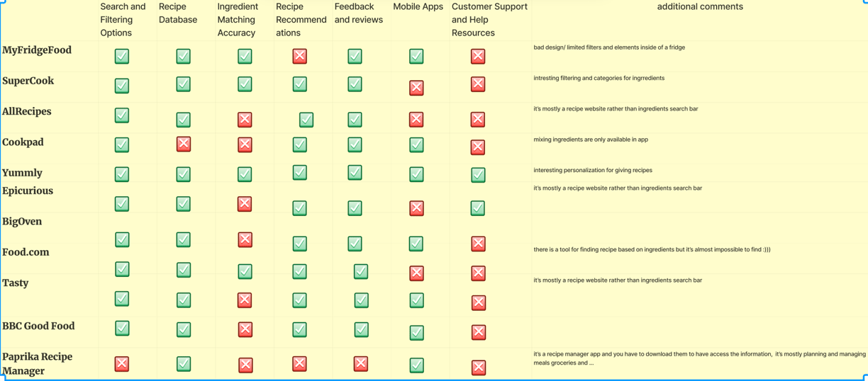
Compettive analysis
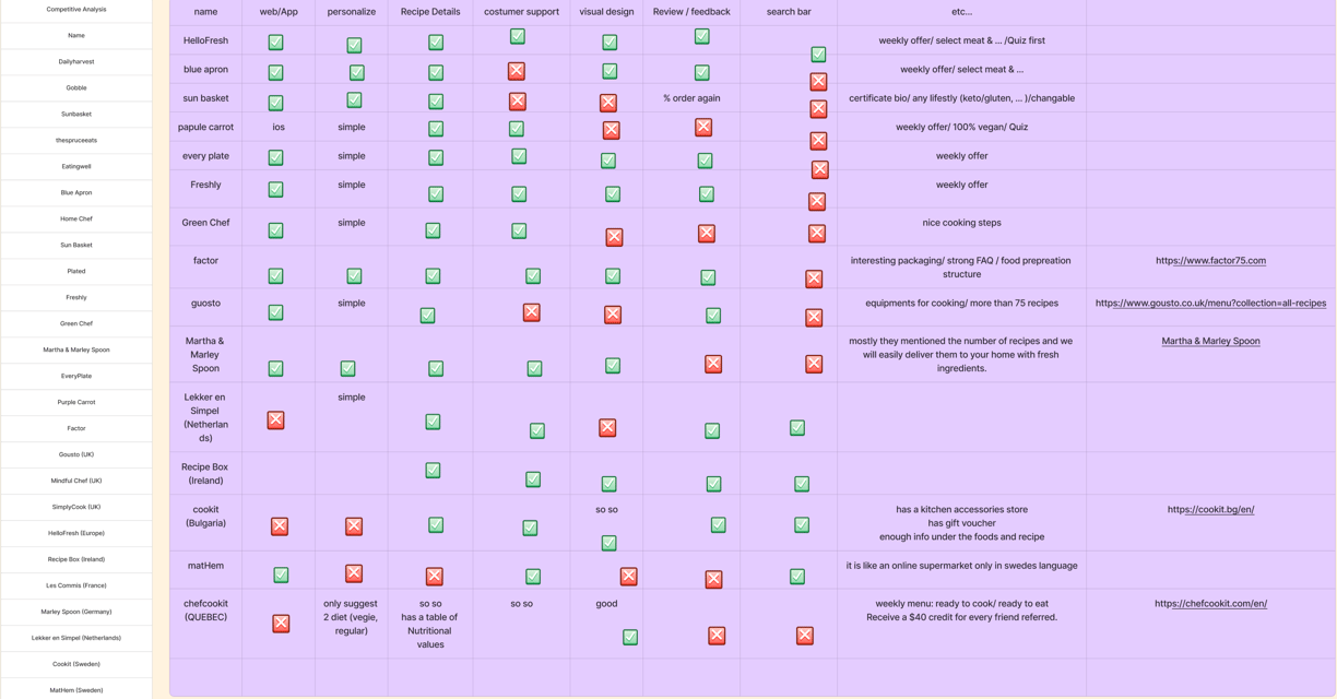

What we learned and observed from our competitors?
Website/App Navigation:
Check how easy it is to move around the website or app.
Look for clear and easy-to-use menus, buttons, and links.
Ensure the content is organized well so users can quickly find what they need.
Registration and Onboarding:
Look at how easy and clear the registration process is
Personalization:
Look at how well the service personalizes dietary preferences and meal plans.
See how well the service suggests recipes or meal plans based on user preferences.
Recipe Details:
Look at how recipes are shown, including ingredients, cooking steps, and nutritional information.
Consider using images, videos, and extra tips to help users understand.
Account Management:
See how users can manage their accounts, update payment information, and change account settings.
Check how easily users can access their order history and receipts.
Delivery and Tracking:
See how the delivery tracking works, including notifications and real-time updates.
Check how issues or delays in delivery are communicated and fixed.
Customer Support:
Look at how easy it is to get help from customer support (e.g., chat, email, phone).
Check how easy it is to find FAQs and self-help resources.
Mobile Responsiveness:
Test how well the website or app works on different devices and screen sizes.
Make sure the website or app is easy to use on smartphones and tablets.
User Reviews and Feedback:
Look at user reviews and feedback on platforms like Trustpilot or social media.
Identify common problems or things that users like.
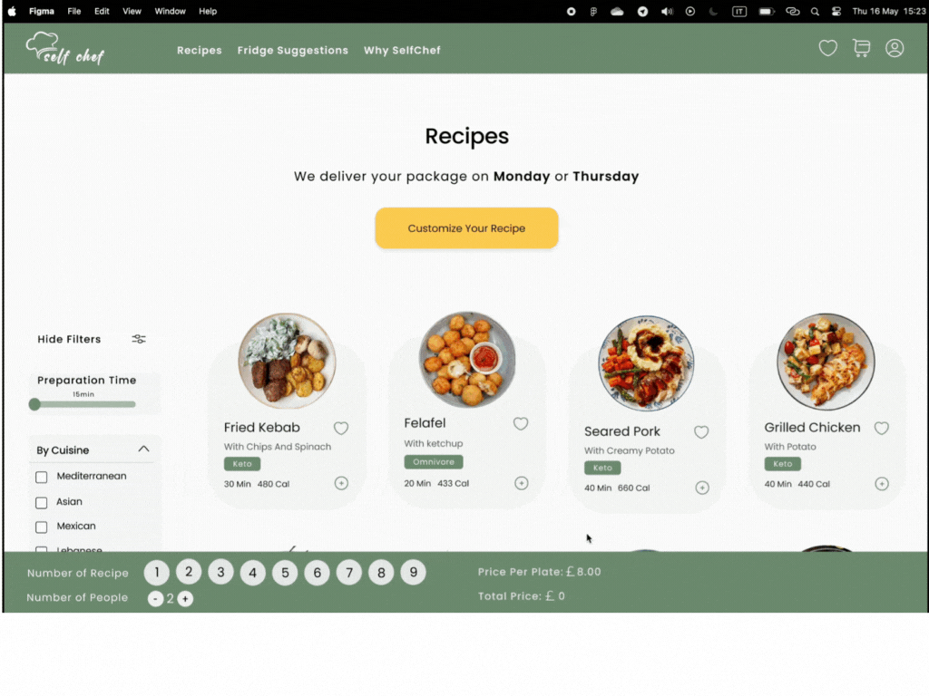
We offer two services: a paid service on the desktop version and a free mobile version. The former allows users to select ingredients at home and receive free recipes. Developing the mobile version required a different research approach for better results.
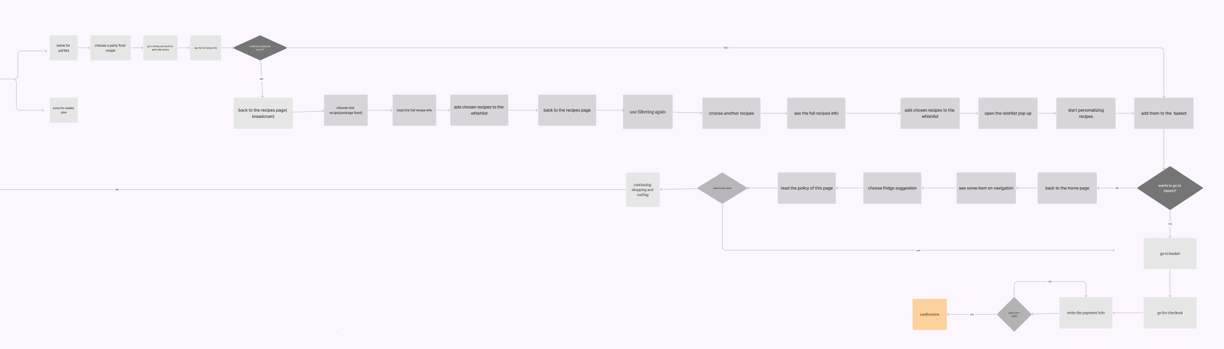
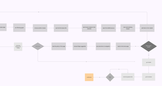
User Flow
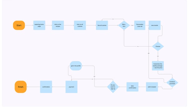
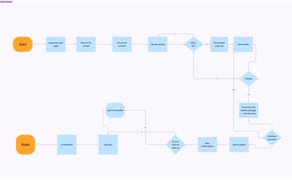
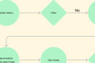
Desktop Flow
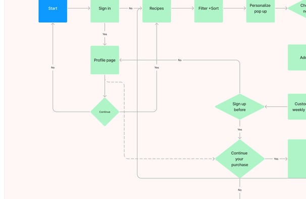
Mobile Flow
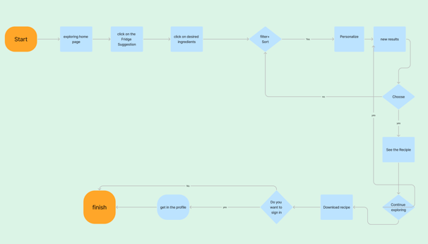
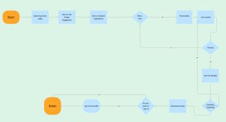
After several usability tests and iterations, we reached these flows for desktop and mobile, which have worked better than previous versions.
Some of the Iterations


We deleted unnecessary steps for users to reach the meals and choose them
Deleting the Party Dining Feature
Making the registration process optional and avoiding frustrations for users
Changing the personalization step for users and making it more visible
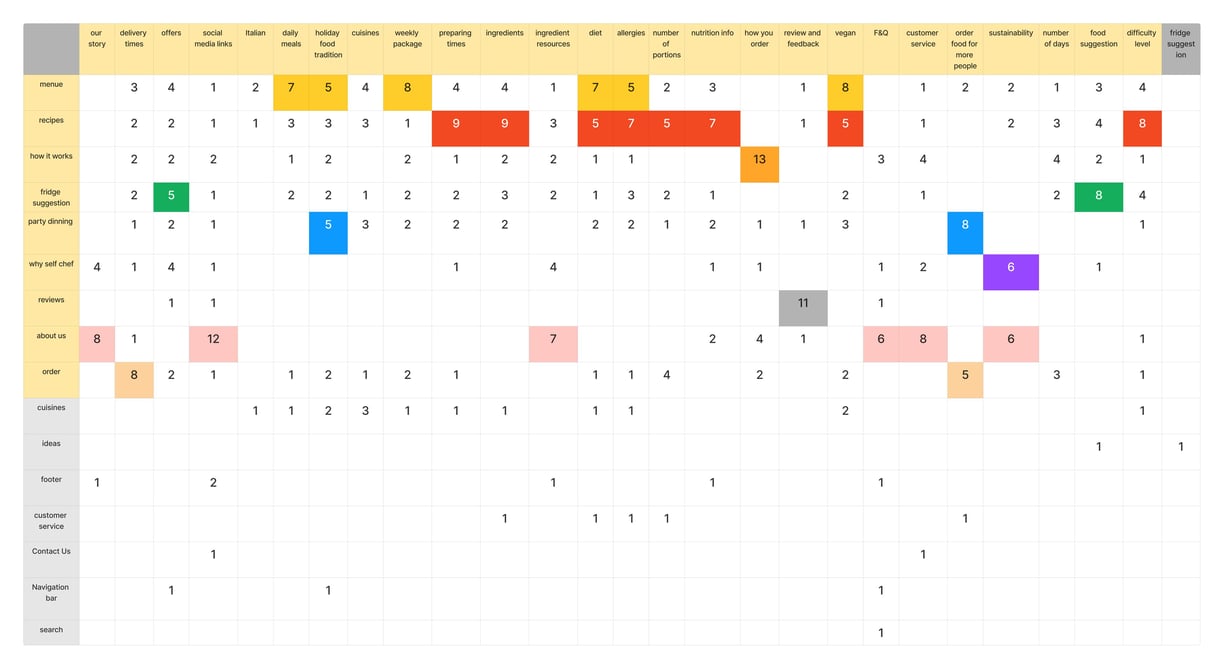
Card Sorting and Site map
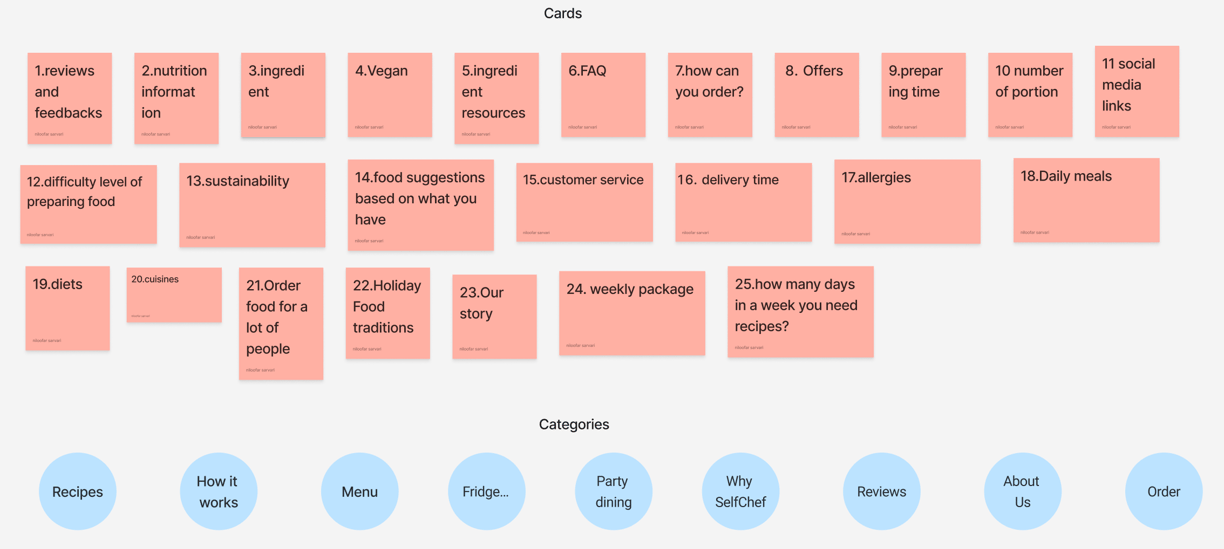
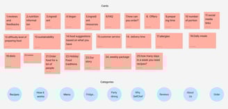
For the card sorting activity, we used 25 cards and nine categories. We sorted with 12 users, ten online and 2 in person. After these sessions, we made a table to organize the results. Discovering how people understand and categorize information ensures we create an information architecture that matches users' expectations.
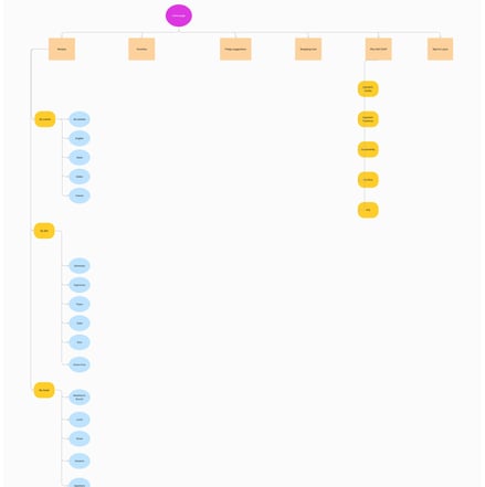
Site map
After card sorting and user flow, we built our site map to help us keep track of what we're doing, where we're going, and how the website will evolve. We went through several iterations to find a better map.
Card Sorting
Persona and Mood Board

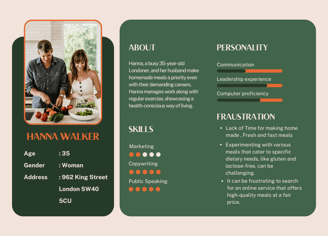
With the help of our research, we were able to create a persona to identify critical patterns and themes among our ideal users.
Persona
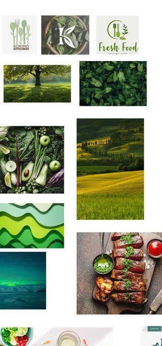
Mood Board


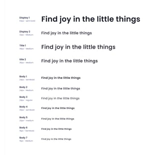


Color Pallets
Typogeraphy
CTA Format
Usability tests and Prototype
We conducted user testing at different project stages to identify which features would most impact customer experience. This will lead us to make more iterations because design does not exist in a vacuum.
Usability Tests
Issue 01
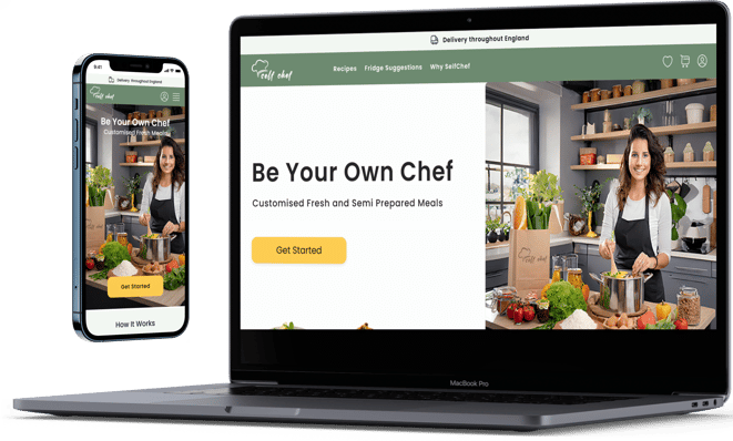
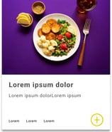
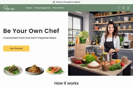
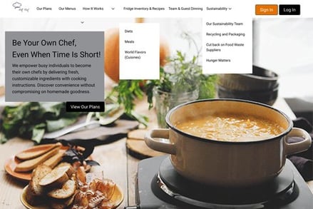
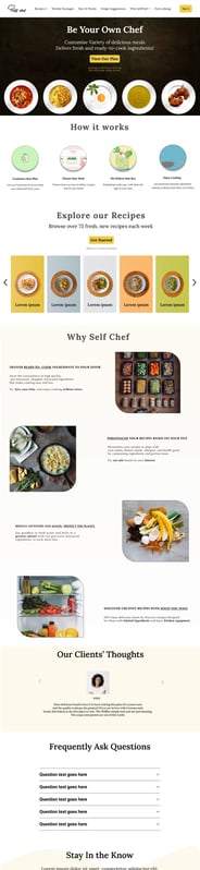
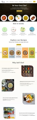
Designing the hero was the most difficult part of our project. We created over ten initial pages with different colors and hero images to grab the user's attention right away.
Solution 01
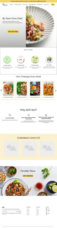
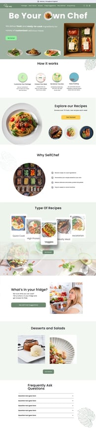
After hundreds of iterations, meetings, and receiving help from our mentor and user feedback, we finally agreed on our latest design. The page can now quickly show the product and business within 3 seconds.
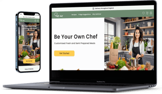
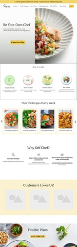
First Version
Last Version
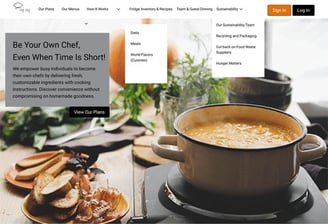
Reducing Items on the Nav bar and keeping only Items that the user will need on every page to navigate
Deleting the sub-Nav Bar to avoid confusion
Summarizing Hero's description, we realized that users do not read and don't pay attention.
Adding the delivery place at the top because users needed to see that in the first place
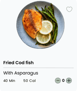
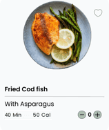

Issue 02
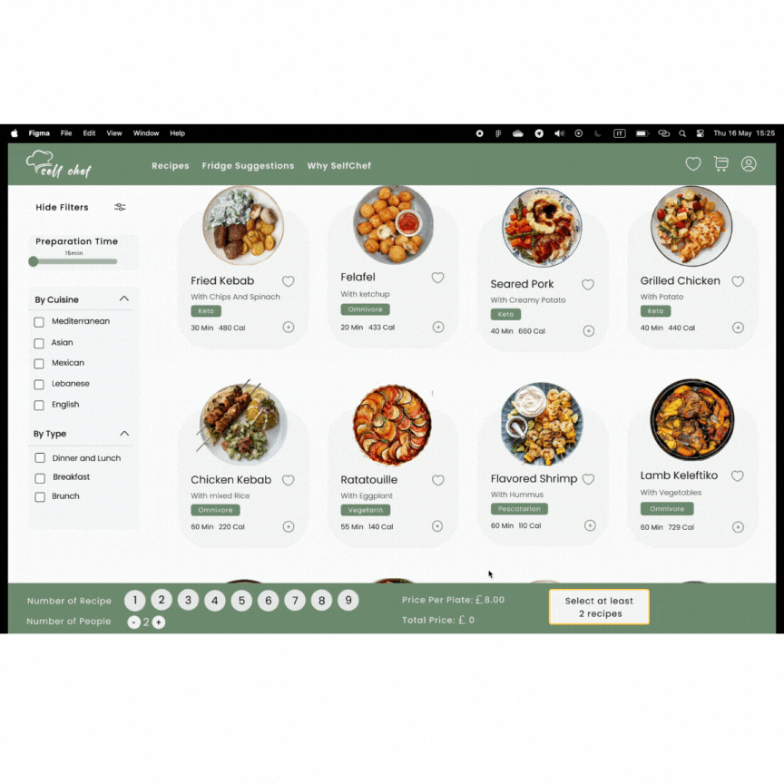
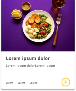
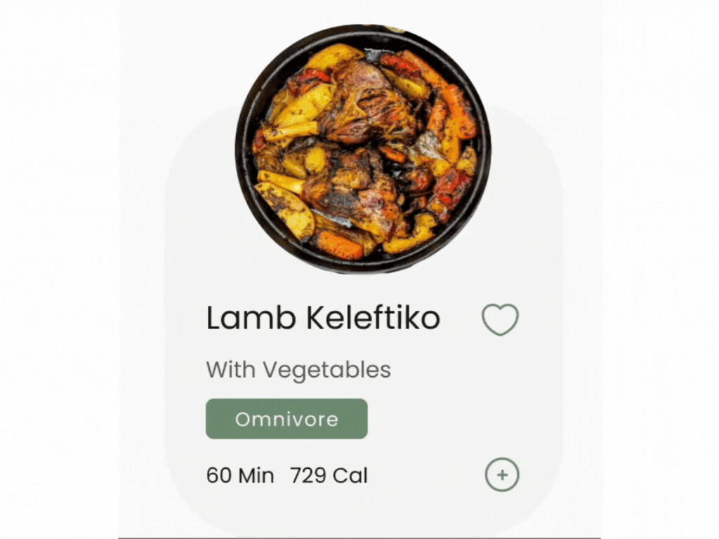
The cards weren't visually attractive and engaging for users to persuasion for purchasing
Solution 02
We solved this problem by changing the design of the cards and adding micro-interactions, as we had feedback from one of the users: " It makes you hungry."
Prototypes
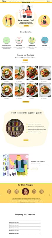
After conducting UserTesting with users, we have successfully developed hi-fi prototypes following the evaluation of medium-fidelity prototypes. Through this process, we have determined that the design featuring an additional navbar at the bottom is the optimal choice.

Learnings
What did I learn?
As part of a concept project, I designed and created an adaptive website for laptops and mobile devices. Throughout the process, I learned much about user experience, accessibility, teamwork, and problem-solving.
Were there any insights from user research that surprised me?
I was surprised to learn that users care more about a feature's ease of use than its beauty. That's why we have made multiple changes to our cards and homepage. We now understand the importance of transparency and making the product easily understood within seconds.
What was the most challenging thing about this project, and how did I overcome it?
The project presented several challenges, the most difficult of which was developing a user-friendly flow to prevent confusion. We successfully achieved this through extensive research.
What part of the design process did I particularly enjoy?
The project taught me a lot, especially the part where I improved designs and tried them out with users. Getting quick feedback made our designs more transparent, and it was great to know that users would like and understand them.
You didn’t come this far to stop. Want to work with me? Feel free to contact me!